A New Way to View ISB’s Publications
 isbscience.org/news/2016/10/26/new-way-view-isbs-publications/
Communicating basic science research to a broad and diverse audience poses a few challenges. The questions that drive ISB’s communications strategy and tactics concern how best to optimize lean resources in order to convey research milestones in ways that are detailed enough to address our scientists’ standards for specificity and also are accessible enough to connect with our lay audience. We constantly ask ourselves how we can take a given piece of content and adapt it for a number of applications: ISB’s website and news blog, print and electronic newsletters, Facebook, Twitter, LinkedIn, YouTube. Each platform has different protocols and languages, and we have to know how to translate research to suit those applications.
ISB’s communications team consists of a director and a designer. Having a small team allows us to be nimble and minimizes the potential hurdles and “analysis paralysis” that larger teams sometimes face. As a result, we are more open to experiments and we understand that not all efforts succeed. For example, we partnered with an external team to create a mixed reality Microsoft HoloLens experience that ties together some of the complex concepts in systems biology. The project ultimately wasn’t feasible, but we at least made the attempt.
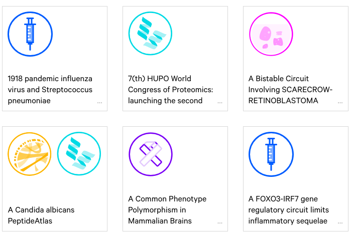
More recently, we teamed up with Schema Design to develop a new way to view ISB’s published research. This project utilizes the Arrays data visualization platform that Schema developed. Since ISB’s founding in 2000, our scientists have published more than 1,500 research papers in top-tier journals, which are listed in a straightforward database. We wanted a more visually impactful presentation for this information.
Visit ISB’s new publications microsite: isb.io/arrays. We asked Christian Marc Schmidt, the principal at Schema, to share some thoughts:
Q: What was the most interesting aspect of creating a visualization for ISB publications?
CMS: The most interesting aspect was the notion of tracking the influence of ISB on other publications through keywords. Looking at the keywords timeseries graph, you can clearly see the rise of “systems biology” as well as other related keywords.
Q: What was the biggest challenge and how did you solve it?
CMS: We had to bridge the keywords graph with the ISB publications. Connecting the two datasets by year ended up being the most intuitive option.
Q: What is the benefit to presenting data in multiple ways?
CMS: The benefit is to allow for multiple readings. Data can tell many stories, and being able to view it from multiple perspectives allows you to ask more questions in order to form more accurate hypotheses. While we can see that “systems biology” is increasing in popularity, is it due to an overall increase or merely an artifact of a higher volume of publications overall? An important factor of multi-variate data visualizations is that they encourage asking more and deeper questions, in pursuit of the truth.


